
Explaining net zero without visuals is like describing a meme over the phone.
It just doesn’t land😂
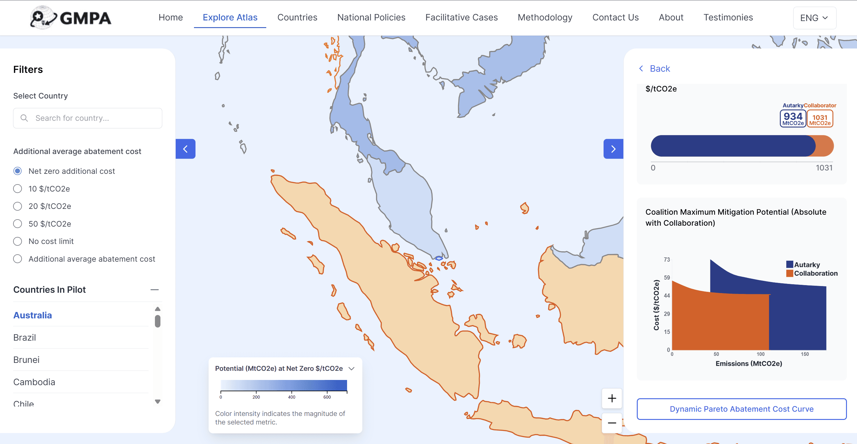
Our demo below takes you inside the Pareto Abatement Cost Curve (PAC curve). The PAC curve shows the trade-off between costs and emissions:
👉🏻 Build a system with lower emissions → costs rise.
👉🏻 Build a system with lower costs → emissions rise.
Simply put: y‑axis is cost, x‑axis is emissions. Together, they reveal the choices that shape our energy future.
This isn’t just a chart — it’s a decision tool. Watch the demo, explore the PAC curve directly in https://mitigationatlas.org/
and see how reporting transforms into reduction.🌏
More features are on the way — stay tuned, because the curve is just the beginning.
#CarbonMarkets #SustainabilityTech #NetZero
Watch the demo video at https://www.linkedin.com/posts/moya-analytics_carbonmarkets-sustainabilitytech-netzero-activity-7442806196723527680-9Dri?utm_source=share&utm_medium=member_desktop&rcm=ACoAADZtw6kBsJpaqHfprJ8P1GmoqbDnX1Se3uA
Thanks for reading.
Interested in collaborating with MOYA Analytics? Reach out to our team and let's build better climate intelligence together.